reMarkable Blog – 8.12.20
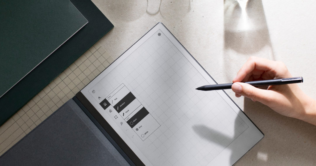
How do you take something really simple, and make it better not by adding more, but by stripping it down?
It’s a question reMarkable’s VP of user experience, Brynjar Barkarson, and VP of visual design, Didrik Rasmussen, often need to consider. For them, improving the user experience (UX) is about finding the right balance between modern functionality, and simplicity.
Source: Inside reMarkable 2 — Chapter 2: the user experience
